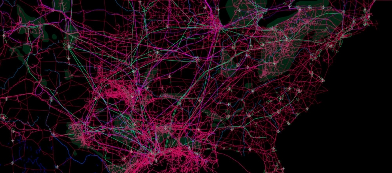
Data: Mapping the Connected Planet
Mapping the Connected Planet – Connectivity Atlas https://t.co/9R66Ub1p9h #datavis — Binary Studio (@binarystudio) May 24, 2016
Mapping the Connected Planet – Connectivity Atlas https://t.co/9R66Ub1p9h #datavis — Binary Studio (@binarystudio) May 24, 2016
The Power Of A Picture – How Netflix manipulates images to increase viewership https://t.co/3YX2YUmfjM #design #data pic.twitter.com/eIGpjY0nV1 — Binary Studio (@binarystudio) May 21, 2016
Via: PSFKThe routes of New York City delivery cyclists were tracked using GPS and displayed with an animated infographic. It then zooms out to reveal the journey that the nationwide supply chain [...]
Lovin the custom UI design using styled maps on this execution. Reminds us of the work we completed for McGregor + Coxall a few years back. Check [...]
Via Springwise.com The developer decided to create an updated version of the game, hacked to receive input from a webcam located above 5th Avenue, which translates real traffic into digital [...]
Always appreciate the complexity of this simple patterns. — Via Co.Design The incredibly detailed infographics by Jer Thorp do the knock-off series of superhero scraps almost too much [...]
Exo is a visualization tool for exploring the nearly 2,300 exoplanet candidates that have been so far identified by NASA’s Kepler mission.
So you want to pen an award-winning novel. Here’s some advice: Write about death. Or love. Or–if you’re feeling really adventurous–homicidal cowboy brothers. via FastCo
Pimkie, a french fashion brand created Color Forecast, a website that shows you in real time what colors people are wearing in the fashion capitals. So you always get your colors [...]
Global Migration Patterns [mpg.de] by the German Max Planck Institute for the Study of Religious and Ethnic Diversity contains a set of interactive instruments that visualize the latest global [...]


