Simple but effective best practces and takeouts of from the Sears 2011 Xmas outdoor mobile campaign. Read the full article for a summary of the results.
—
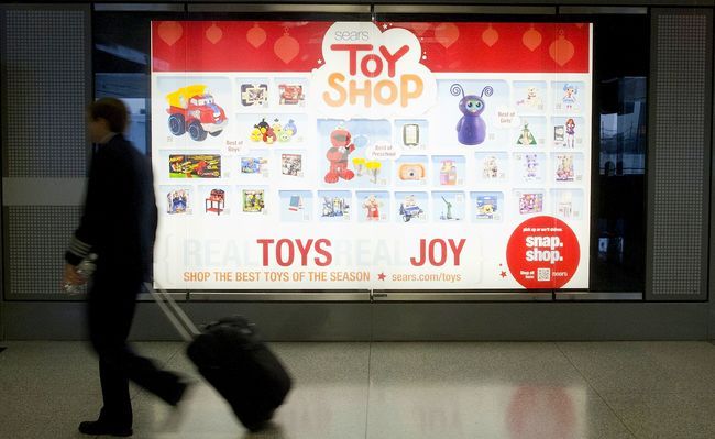
Sears set forth to test the idea of QR codes as mobile bridge and shopping activator. But just to be safe, they also included a short URL that took the consumer to a mobile friendly shopping landing page.
Three QR Code Campaign Best Practices
- Include instructions on your displays and ads that tell the consumer what to do. In Sears’ case, they had the red circle with Snap. Shop. and a QR code with “shop all” next to it. Was that enough “instruction” for the average consumer? Maybe or maybe not. Be sure to check out one of the interesting results Sears shared with me and then decide.
- Consider location context. Sears placed their installations where the consumer would have “dwell time” (I love that term) like airports, bus shelters, movie theater lobbies, and one that I thought was a fabulous idea food courts in malls. Again, be sure to see the results section for another really interesting piece of learning re: location of your QR enabled advertising.
- Always provide a short URL option. You’ll notice that Sears nails this with a short URL that is easily findable and quite easy to type. Users that entered the URL on their mobile phone were taken to a mobile friendly Sears store that featured the toys you saw on the installation. In fact, if you enter Sears.com/Toys on your mobile phone you can see the site as it is still live.


